Following in the Footsteps of Professionals..
I have researched into three interesting websites which are the most appealing to me to work by in order to increase my websites visual style and quality to become an ultimate online portfolio. By looking at all three different styles and ideas I have really found some great hints on how they have made certain elements to their sites to make them perfect as an online portfolio. The main hints that I have discovered is that a lot of these elements are being created by Adobe Photoshop and Illustrator and are simply being uploaded as a template to complete the website; this is what I will plan to do in order to achieve a successful looking website.
Website: 1.

This website above is very detailed and interesting, the house styles work very well and the layout is very interesting, however. There is a lot of unused space to the right which is being used for virtually nothing so reducing that or maybe making the layout central would improve the visual quality. The font style and colour works well with the website but doesn’t strive to help colour-blind users like myself. The hyperlinks are very small; some users might find it difficult to navigate. I like the background colour choice and it brings focus to the white font text. Will experiment this kind of idea one my website.
Website: Toby Powell

This website is another very detailed and interesting website. The house styles work pretty well and keep to basic blacks and whites and shades of gray (ideal for colour-blindness). There is a lot of unused space to the left, it’s just an image and a part of the main banner dominates the top left space. The font style and colour works well with the website but isn’t very large. I wouldn’t use this style at all. Crumpled paper for a background is original but boring. The hyperlinks are very small; some users might find it difficult to navigate but are much clearer than website number 1. Blog links are small icons. In my website I would definitely target larger blog and various site links to encourage users to visit them.
Website: Christian Cook Portfolio
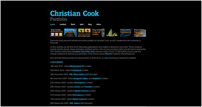
My friend Christian Cook’s Portfolio website is very interesting and very detailed. The house styles work very well with the black background gray/white/light blue text and the amazing XML gallery hyperlink banner (links to his blog works) under the main links. It is very central and uses the best of the space to dominate the central area which is ideal to keep focus whilst reading the information. The font style and colour works well with the website but isn’t very large. I would definitely use a similar style to this, but I would really go for a larger banner to cover the top centre of the page along with large, interactive hyperlinks similar to this. The hyperlinks are very small; some users might find it difficult to navigate but are much clearer than website number 1 and 2. I would consider this kind of layout and style more than website 1 and 2.
No comments:
Post a Comment